Post Processing Style Evolution
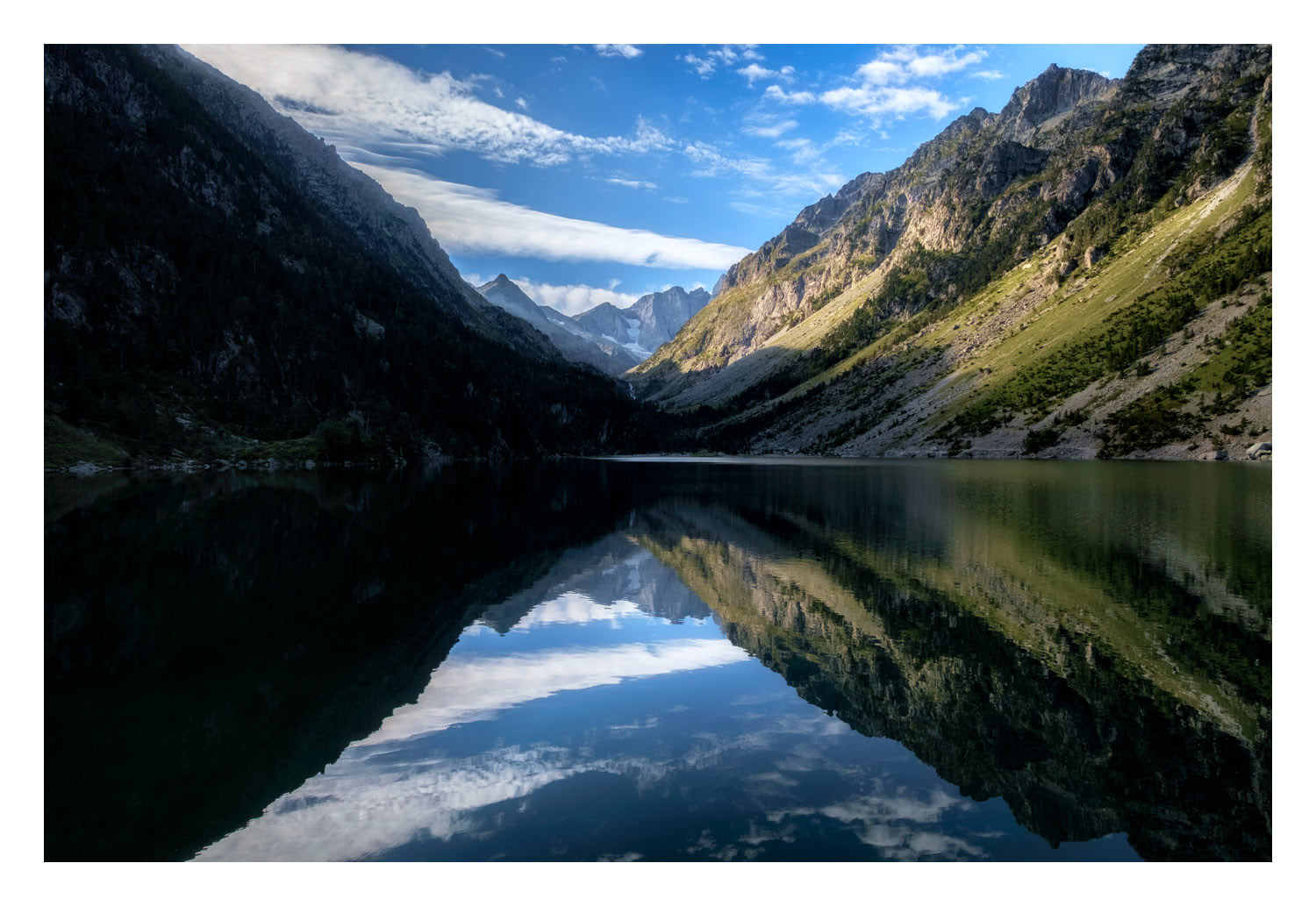
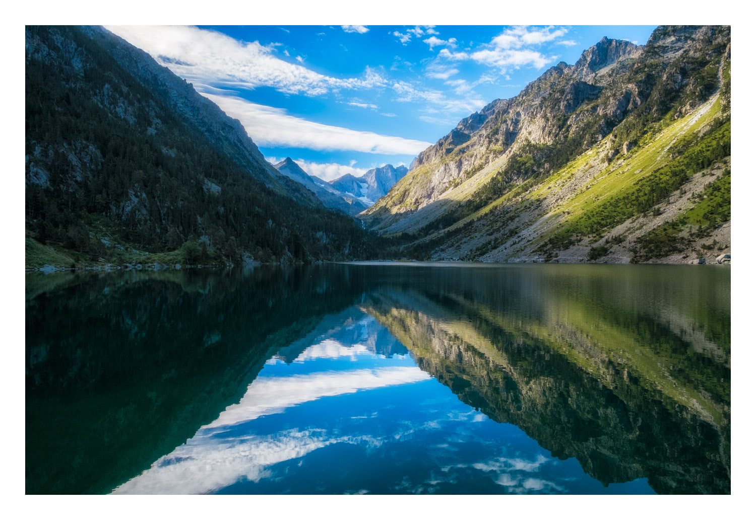
/As I was digging through my catalogue of images for my XF 18-55mm F2.8-4 OIS review, I came across the image below. It’s your typical vacation snap, nothing terribly noteworthy, but I like it, and figured I’d reprocess it anyway. It’s not uncommon for me to look back at my post processing, especially in my earliest days of shooting, and find myself somewhat aghast.
In this case, I don’t hate the way I had processed this image before, but I don’t like it either. There is a lot about it that is no longer to my taste. Believe it or not, I was long since out of my days of wanting to extract every last bit of detail from shadows when I first edited this photo, but even then, I think I was much too heavy-handed on the Shadows slider in Lightroom. I started with Adobe’s built in profile since that’s all there was available back then, whereas today I started with PROVIA. Less vibrance, more contrast, I don’t know what I was thinking with the sky and the greens on the mountains. Probably that I wanted to emphasize the warmth of the sun hitting the mountains. Now I find my eye hunting around the frame, side to side, and top to bottom with the reflection. With the left side more in shadows, it encourages a subtle rule of thirds, and lets my eye rest where the sun hits the mountains after the clouds lead it there.
Maybe you agree with me, maybe you think I’m out to lunch and my first pass was better like my wife does. Or maybe you think they both suck, and that’s fine. What’s interesting to me is how we as photographers grow and evolve, not just in the kinds of images we capture, but also in how we handle them after the fact. I am the furthest thing from a SOOC snob. I still enjoy tinkering with an image in Photoshop, and man, would I like to have the time to take another processing pass on a lot of my older images.
