Fuji X100T vs. X100S vs. X100 a little too.
Originally Published: September, 2014
Last Update: November, 2014
Introduction
The X100T is a further refinement to Fuji’s X100 line. The original X100 with firmware 1.0 was an alpha product at best. After a few firmware releases, it became what I would equate to a public beta. The S is the first release, and the T contains all the refinements needed to cement the X100’s position as being the one Fuji camera I’d have, if I could only choose one.
The evolutionary changes to the X100 always fall under two key categories, hardware, and software. While this might seem obvious, it seems a lot of people considering which Fuji camera to buy only take one or the other into consideration. In this article, I will look at both categories independent of the other, in addition to the cameras as a whole. We’ll start with hardware, but for those looking for a quick answer to the question about whether or not to buy, here it is:
| X100 camera currently owned | None | X100 | X100S |
|---|---|---|---|
| Should you buy? | Yes | Yes | Maybe |
For the fine-grain analysis you’re accustom to finding on Fuji vs. Fuji, read on.
If you would like to purchase either of these cameras, or anything else for that matter, please consider using one of the affiliate links below. The price is the same for you, but a small percentage of the purchase price goes to me, which really helps keep this site going. Thank you!
Specifications
| X100T | X100S | X100 | |
|---|---|---|---|
| Announced | September 10, 2014 | January 7, 2013 | February 8, 2011 Shown at Photokina in September, 2010 |
| Released | Fall 2014 | March, 2013 | March, 2011 |
| Price (MSRP) |
$1,299 USD | $900 (if you can find one) |
Discontinued $600 used |
| Sensor | 16.3MP APS-C X-Trans CMOS II sensor | 16.3MP APS-C X-Trans CMOS II sensor | 12.3MP Bayer CMOS sensor |
| Processor | EXR Processor II | EXR Processor II | EXR Processor I |
| Viewfinder | Advanced hybrid viewfinder, with electronic rangefinder (ERF) | Hybrid optical electronic viewfinder | Hybrid optical electronic viewfinder |
| OVF coverage | 92% | 90% | 90% |
| OVF parallax correction | After focus is acquired during autofocus and real time on manual focus | After focus is acquired in autofocus | After focus is acquired in autofocus |
| EVF resolution | 2,360,000-dot High Definition LCD panel | 2,360,000-dot High Definition LCD panel | 1,440,000-dot |
| EVF rotation | No | No | No |
| Improved viewfnder interface | Yes | No | No |
| Autofocus | Faster Intelligent Hybrid AF | Fast Intelligent Hybrid AF | Slower Contrast AF |
| Direct access to AF points | Yes | No | No |
| Exposure Compensation | ±3EV | ±2EV | ±2EV |
| Interval Shooting | Yes | No | No |
| Start-up Time | 0.5 seconds | 0.5 seconds | “Fast” |
| Shutter lag | 0.1 seconds | 0.1 seconds | “Low” |
| Continuous Shooting | 6 fps to a maximum of 25 frames (JPEG) or 3 to card capacity | 6 fps to a maximum of 31 frames (JPEG) or 3 to card capacity (Assumed) | 3 or 5 fps to a maximum of 10 frames (JPEG) |
| Maximum shutter speed | 1/32,000 of a second electronic, 1/4000 of a second mechanical at f/8-16, 1/2000 at f/4-5/6, 1/1000 at f/2-2.8 | 1/4000 of a second mechanical at f/8-16, 1/2000 at f/4-5/6, 1/1000 at f/2-2.8 | 1/4000 of a second mechanical at f/8-16, 1/2000 at f/4-5/6, 1/1000 at f/2-2.8 |
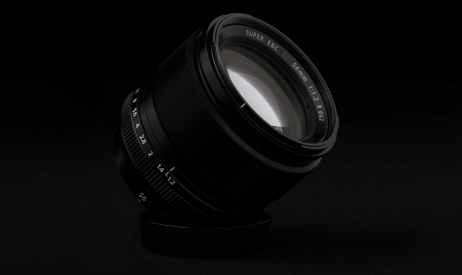
| Lens | FUJINON 23mm f/2.0 fixed lens (35mm equivalent) | FUJINON 23mm f/2.0 fixed lens (35mm equivalent) | FUJINON 23mm f/2.0 fixed lens (35mm equivalent) |
| LCD | 3.0-inch (1040K-dot) | 2.8-inch (460K-dot) | 2.8-inch (460K-dot) |
| Enhanced Q Menu | Customizable Q Menu | Standard Q Menu | Standard Q Menu (configurable to “RAW” button with firmware 2.0) |
| Rear command input | Dial | Toggle | Toggle |
| Classic Chrome | Yes | No | No |
| Battery life | “Up to” 700 photos per charge when using OVF only and Power Save mode on | 330 photos per charge | 300 photos per charge |
| Flash | Super Intelligent Flash | Super Intelligent Flash | Super Intelligent Flash |
| Close Focus | 10cm | 10cm | 10cm |
| Focus Peaking | Yes – with colours | Yes – white only | Yes – white only |
| Improved Video | Yes – More frame rate options, shoot video through OVF, manual exposure set during video | No – Fewer framerates, Full auto only | No – Fewer framerates, Full auto only |
| WiFi Capabilities | Yes | No | No |
| Size | Slightly less deep126.5 (W) x 74.4 (H) x 53.9 (D) mm | 126.5(W) x 74.4(H) x 53.9(D) mm | 126.5 (W) x 74.4 (H) x 53.9 (D) mm |
Hardware
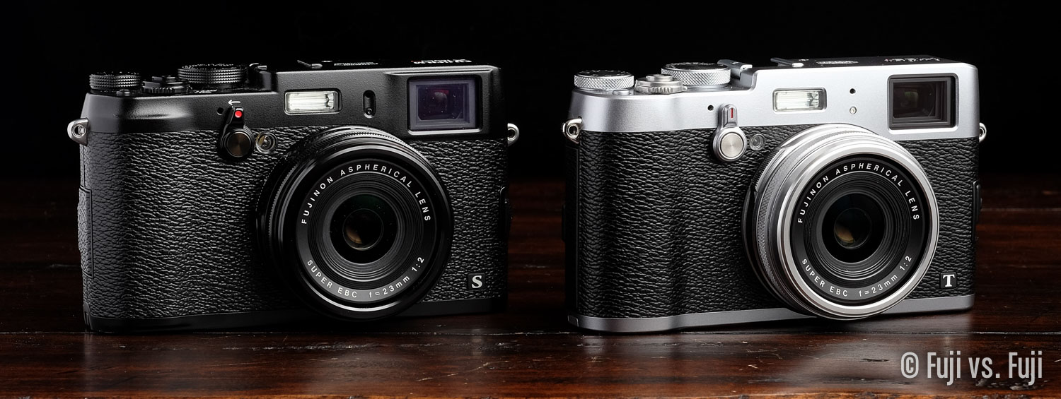
It’s easy to look at all 3 iterations of the X100, and think little has changed. At a quick glance, and even an extended examination by those who aren’t entrenched in the camera world, they are extremely similar. In use, however, the X100S offered at least a few improvements to its hardware along with some minor styling changes, and the X100T has more refinements still. For that reason, I’ll largely consider the X100 and X100S as interchangeable when it comes to hardware.
LCD
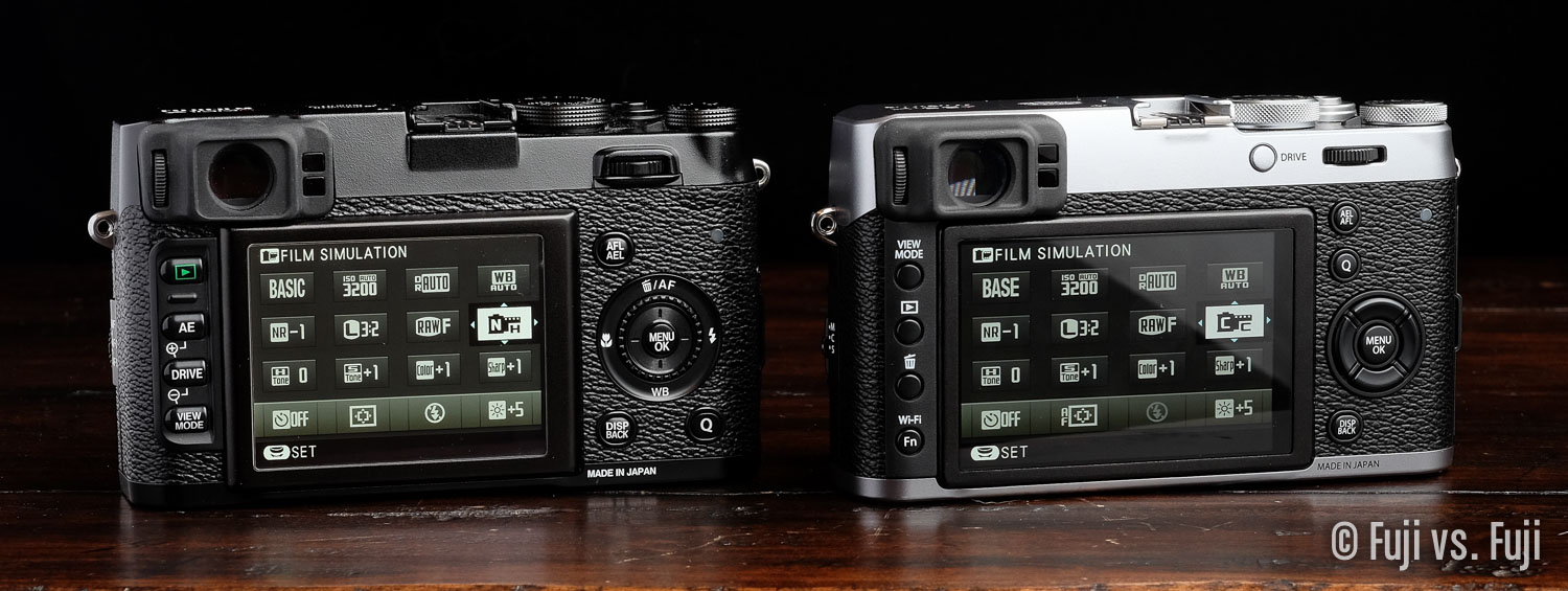
Bigger is better, so long as size doesn’t come with cramped controls or compromised handling. Fuji managed to bring the best of both worlds to the X100T. Not only the is the LCD larger, but the handling as not suffered as a result, and in fact feels more organized and harmonious.
The added resolution is more than welcome too. It’s tough not to be spoiled by all the retina screens we have now. Screens that show pixels quickly become very noticeable.
Sensor
I can hear a lot of you now, “16 megapixels? Again?” Yep, those rumour sites can sure wreak havoc on expectations. We heard everything from 24MP to a tilt screen to an all new lens design. The latter is the most ridiculous given the WCL and TCL Converters would almost certainly not work with a new lens, but I digress.
Only 16MP. If you’re into printing really large, I can understand why you might be griping about 16MP, but if you’re mostly sending your photos online, the main thing more than 16MP will get you is the need to buy more disk space sooner, and more computing power to deal with the files. Me? I’m perfectly satisfied with 16MP. I wouldn’t have minded seeing improvements to noise handling or dynamic range, however. We did get some minor improvements there, but they’re software related.
Processor
Another key component that hasn’t seen an update; the X100T contains the same EXR Processor II as the X100S. The pragmatic part of me sees this as no big deal. The sensor and processor combination has been producing stellar images for over a year now, and it will continue to do so. The less rational side of me draws a comparison with smartphones and how the tech industry would react if, for instance, Apple releases an iPhone with the exact same chipset, and “only” OS-level improvements to make the phone faster. We’d never hear the end of it.
Ultimately the pragmatic side of me wins. The X100T is a better overall camera, but I can see how some may have been underwhelmed with the new feature-set, and that is exactly why X100S owners are advised to consider carefully whether or not they need the upgrade.
Optical Viewfinder
The OVF has seen a number of refinements for manual focusers. Parallax is corrected on the fly, and a handy Electronic Rangefinder (ERF) that pops up in the lower right corner, giving you a zoomed in Focus Assist-like preview of your selected focus point.
Buttons, rings, dials, doors, and switches
The physical controls of the X100T are a bit of a mixed bag. They have mostly improved in subtle, but meaningful ways with only a couple missteps. Let’s take this one by one, starting with the top:
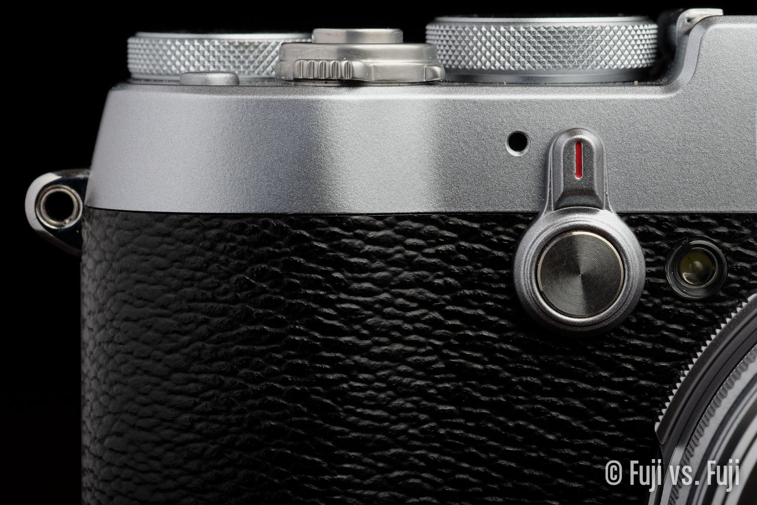
Power Switch: Starting off on the bad end of things, the Power Switch, while essentially the same, is just a little bit worse on the T. It seems extremely easy to accidentally switch on as more than a few times I’ve looked down at the camera to see that it’s on. Additionally, the slight adjustments made to the body has resulted in the lever portion of the Power Switch to be almost flush with the body. This makes the switch paradoxically easier to engage by accident, but less easy to turn on and off intentionally, particularly off. I find myself groping for the switch a few times before I get a hold of it.
Shutter release: Exactly the same threaded shutter release as found on previous models. I’m pleased Fuji didn’t remove the threading with the addition of the Micro USB connector that brings RR-90 remote compatibility.
Shutter Speed and Exposure Compensation dials: Both of of these dials have improved, but the Exposure Compensation dial has improved a lot. It has been notoriously easy to bump out of place on every Fuji camera to date aside from the X-T1. The X100T follows that trend as its dials are nice and tight. I really wish the Shutter Speed dial turned all the way round so I could quickly switch between Auto and Bulb without going through the entire range.
Both dials also feature more selections. The Shutter Speed dial extends the range of selection on the slow end, offering both ½ second and a full second clicks, and Exposure Compensation can now be dialled to ±3EV.
And finally, the dials take on a new cross-hatched grip which is decidely grippier.
Top Fn button: Fuji made slight changes to this button too. It’s slightly larger, and is slightly less clicky, resulting in slightly worse tactile feedback. Slightly. I don’t expect anyone who isn’t quickly switching between both cameras would ever notice this though.
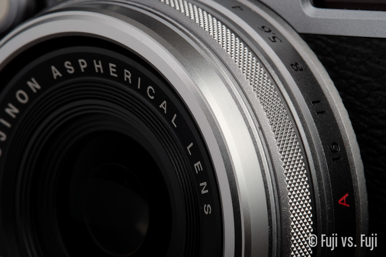
Focus ring: We now have a vastly superior cross-hatched pattern on the focus ring. This better for both form, and function in my opinion. The focus ring, Shutter Speed dial, and Exposure Compensation dial all share the same look now, and the focus ring is much more grippy.
As an added bonus, the included cap now stays on well. Like really well. Almost too well. It’s almost too hard to get off. So perhaps it’s not really a bonus unless you used to lose your X100 cap a lot. I never have, not even close, but I’ve read others complain about it.
Aperture ring: Personally I never had a problem with full stops on my aperture ring. I rarely have much need for ⅓ stop increments on my aperture. In fact, I’d have preferred to disable the fine-tuning control of the aperture with the rear toggle of the X100(S) as it would often be changed accidentally. The aperture ring on the X100T overall is an improvement though. It turns nicer and the aperture is less prone to inadvertent changes.
Bizarrely, and unfortunately, Fuji forgot about the grips on the Aperture Ring, which still have the old slotted grip style. The aperture is the only metal part with grip that hasn’t been updated. I wish Fuji thought to add the cross-hatched grip here as well as the is the ring that needed it most in my opinion.
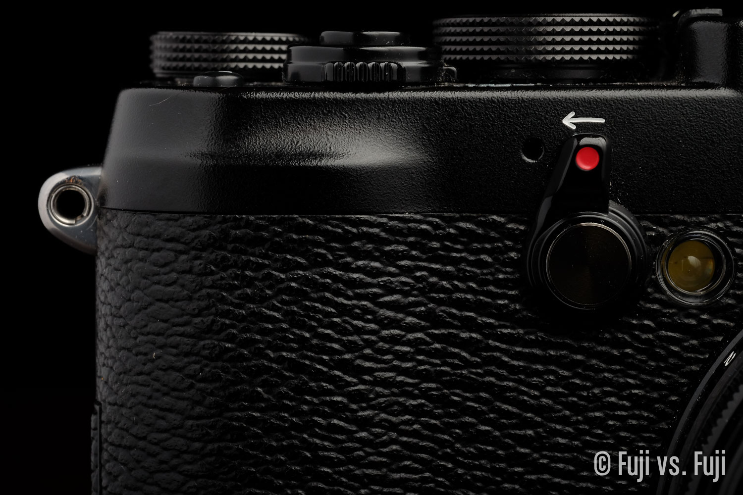
Viewfinder switch: The style of the switch has gone back to the original design. It makes much more sense now as it is bidirectional, and it looks better, but it doesn’t feel quite as solid as the X100S does.
Focus Mode Selector: Overall an improvement. The act of selecting modes is much more sure, and precise. I do wish the kept the grip found on the X100S in addition to the extra protrusion in the middle of the switch. It would be easier to know where my finger is on the switch when not looking at it.
Connector Cover: It feels like the plastic here got a little thinner, and the door could easily be snapped off, but that’s no different from the X100(S).
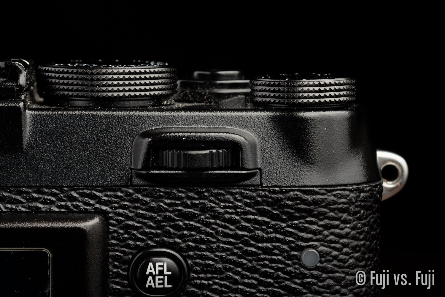
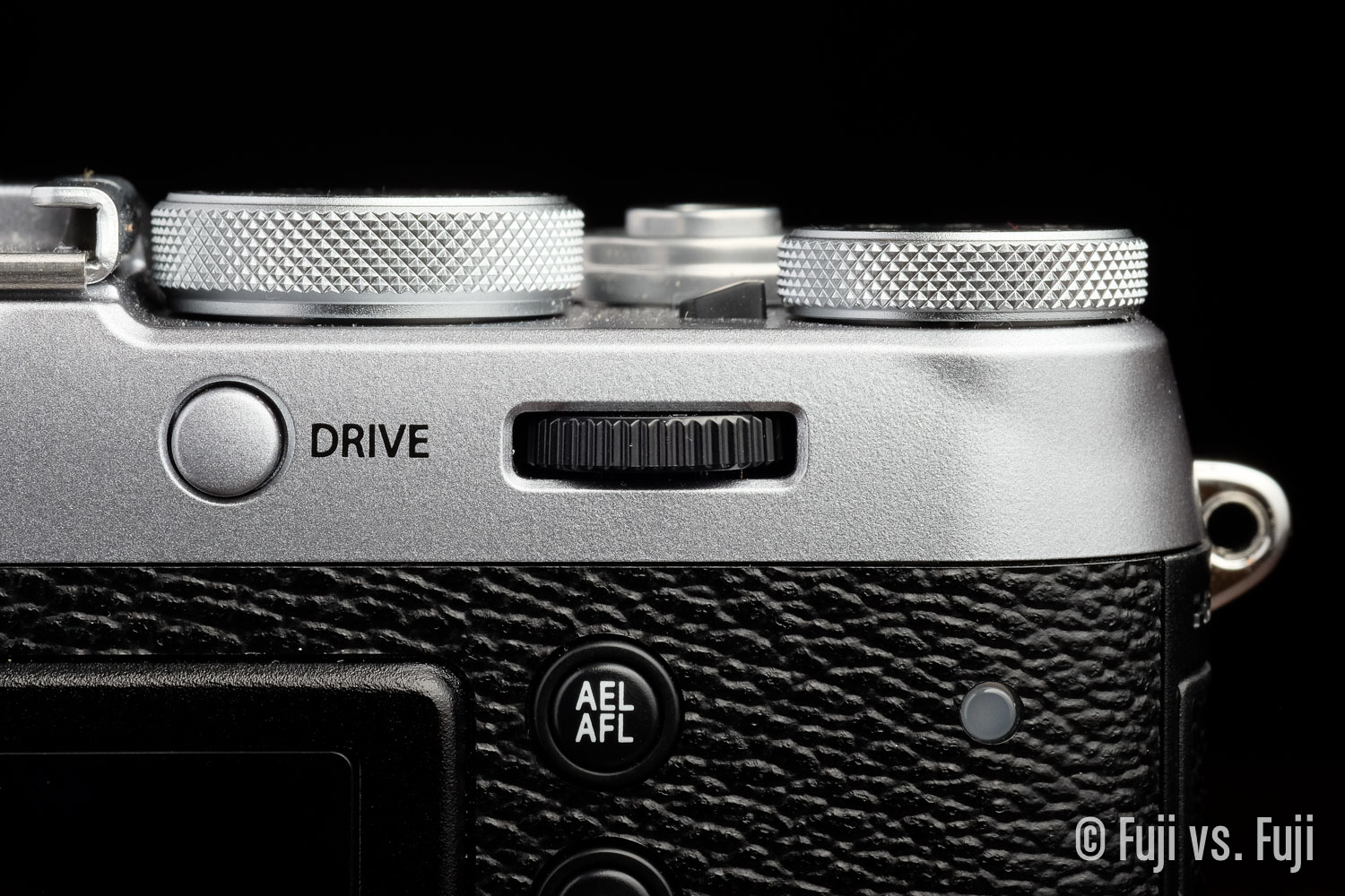
Command Dial: This is Fuji’s best rear dial to date. It’s a joy to turn with perfect tactile feedback in the clicks. It’s just the right distance from the back of the camera so you’ll never have any trouble turning it. If I have to complain, it’s almost turns too easily. Nitpicks aside, it’s a huge improvement from the toggle. Even depressing it to use as a button is significantly better. It reminds me of a high quality mouse wheel.
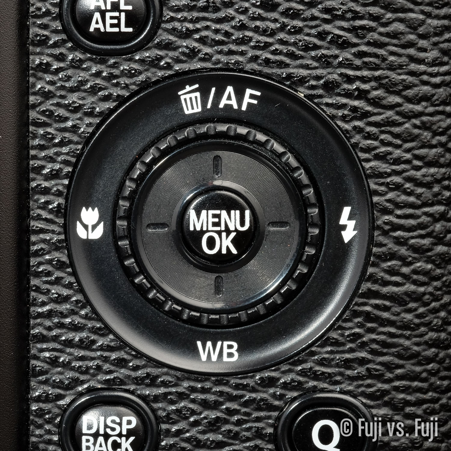
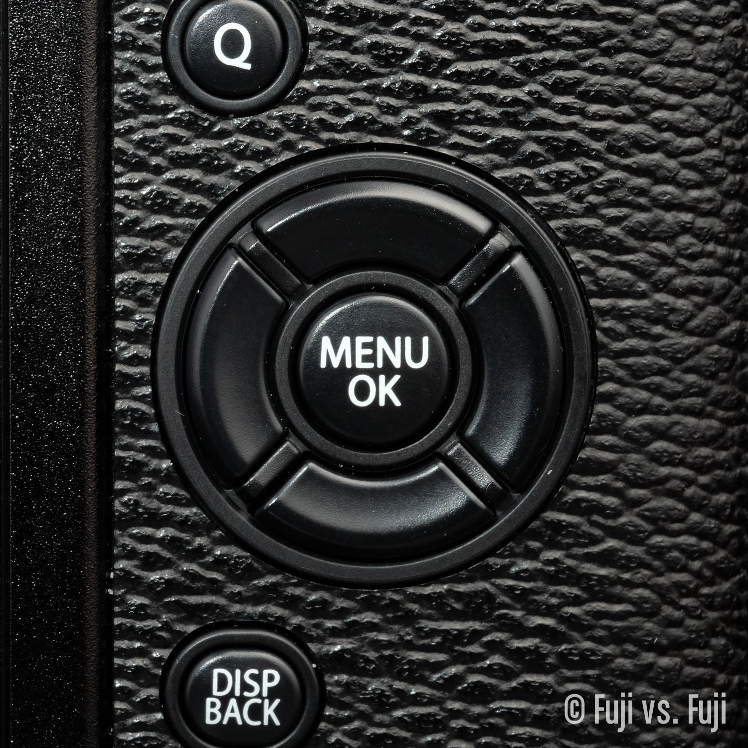
D-pad: So long, rear rotary dial dial. In some ways I liked the dial, mostly for quickly scrolling through Fuji’s menus which tend to change with every camera. Luckily we can now scroll through the menu with the rear Command Dial. The D-pad is fully configurable—just press and hold to select your function—and the buttons are all satisfying to use. No mushy D-pads here. Those days hopefully behind us.
Fuji are also bringing consistency to how their cameras operate. The X-E2 was a transitional period, but the X-T1 and X100T share D-pad functionality. I think we can expect this to come to the X-Pro2, and X-E3 when they arrive.
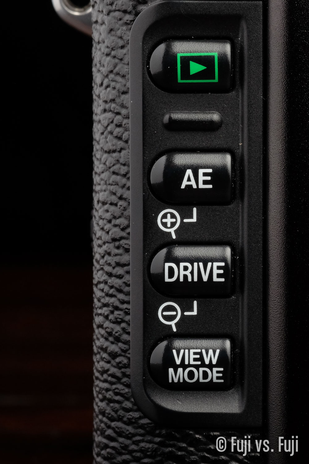
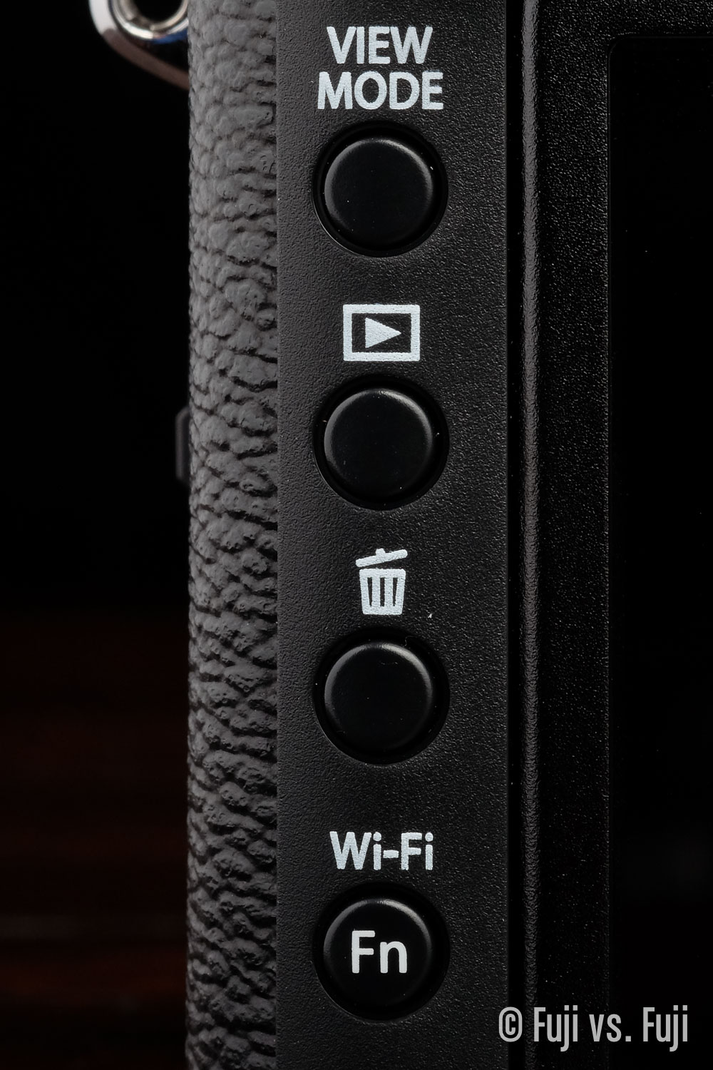
Rear buttons: I didn’t have any problem with the buttons on the left side of the LCD on the X100(S), but the X100T buttons are just as good functionally, and look better too. The buttons on the right of the LCD all work better in my opinion. On the X100S they were a fair bit squishier. The odd one out is the DRIVE button on the X100T; it’s inexplicably soft.
Layout
The overall layout of buttons is now almost perfect. I say almost again for two reasons:
- The Image Review button has no business being anywhere but the top left of every camera. That’s just where it goes. Why Fuji decided to move it down one rather than simply placing View Mode below it, is beyond me.
- The DRIVE button is somewhat senselessly placed right next to the dial that can’t be used to make your selection, and too far from the D-pad that can. If I had my choice, I’d leave the rear of the top plate clean aside from the dial and move the DRIVE button down to the right of the BACK, where the Q Menu button is on the X100S.
A lot of people will likely be adding Fuji’s thumb grip to their X100(S/T)’s. I think it’s a shame to add any size, bulk, or weight to such a wonderfully small camera. I bring this up here because these grips are thought to be necessary in part because of the layout. It’s quite natural for your thumb to fall on the rear dial which can result in unintentional presses or selections. My solution to this is to widen my thumb grip slightly and give myself permission, by way of a screen protector, to rest my thumb on the LCD. Psychologically it might seems strange, but it’s perfectly comfortably and now add-ons are needed.
Fit and Finish
In general, the X100T feels better in the hand and it a more pleasant camera to use. There is one glaring omission for me, and that is the build materialfor the main body of the camera. With the X30, Fuji used a rubberized material that is so grippy, it would be really difficult to drop. I was hoping that finish would be applied to the X100.
Odds and Ends
As mentioned, the body has changed slightly. The depth of the grip is actually the same, but the depth of the rest of the body has slimmed down slightly giving the impression of more of a grip.
The top plate has seen a number of minor refinements. The left Microphone and a small screw have lost the indentation that previously housed them. This leads to a cleaner look on the front. The groove below the power switch has also been removed to the detriment of usability. The edge below the hotshoe has changed slightly, as did the contour around the Exposure Compensation dial. Overall the top plate has cleaner lines.
Finally, if you engage the Dual Display for focus preview, you can actually see the tiny neutral density filter pop up and down in the front of the OVF.
Software
I had been putting this entire section off in anticipation of Fuji announcing some “Kaizen” action for the X100S. It would seem that just about everyone believed as I did that once the initial sales of X100T’s to early adopters died down, we’d see an X-E2 Firmware Version 3 style upgrade for the X100S. It just made sense, and surely the Firmware Version 2.0 that the original X100 received was a far more significant.
Sadly, Fujifilm Japan has confirmed the X100S will not be receiving any further upgrades to its firmware. This is a serious bummer, really disappointed a lot of Fuji fans, and spawned many articles and forum posts questioning how dedicated Fuji is to their own mantra.
I really hope this isn’t the case as “Kaizen” has been one of the Fujifilm brand’s most lauded characteristics. X100S owners who aren’t prepared to upgrade are the first Fuji owners who are justified in feeling snubbed, however I’ll curb my concern about a shift in ethos until at least one more camera that should get features from an update, but doesn’t.
Classic Chrome
If you want to make sure your Fuji pics look like as many other people’s as possible, the best thing you can do is shoot Classic Chrome these days. The gushing over this Film Simulation reached near intolerable levels for me, and actually made it less desirable to use. I don't dislike it, but it has a decidedly more recognizable, and vaguely Instagrammy/American Eagle look to it that almost seems late to the party. Fortunately the gushing seems to have waned a little more recently. I personally still lean towards PRO Neg. Hi when Classic Chrome would be a consideration. Perhaps this is a somewhat controversial stance on a Film Sim that’s so adored by many, but I don’t think it’s a feature worth choosing a camera for.
As a side note, the notion that this feature will not be seen on the X100S is a particularly tough pill to swallow after Zack Arias revealed that he had a “hacked” X100S with Classic Chrome on it. X100S owners lamented that the firmware all but exists, but would not be available to them. I said it on Twitter and I’ll say it hear, a factory-modified firmware that includes and additional Film Simulation mode ≠ a shippable firmware update.
UI
Now that I’ve had a good amount of time with the new UI of the X100T, going back to “old” is tough. The combination of the smaller screen and chunkier icons make the whole thing feel dated; a little like going back to a monitor that’s 1024 × 768.
It’s also great to be able to change things like ISO and Film Simulation mode while still being able to see the screen, and in general the interface gets out of your way more to let you focus on shooting.
With that written new user interface is a bit of a mixed bag for me. I really prefer the overall refresh in the “look and feel,” but find myself hunting the screen for things that used to be more quickly recognizable than they are now. Add to that the amount of new features, some of which are buried a little too deep for my liking and you end up with a UI that is less “discoverable” than it could be.
Here’s a list of grievances:
- The histogram is smaller. If I have the histogram visible, I want to see it. I’d also like some indication of where clipping will occur by way of a different-coloured Y-axis line at either end of the spectrum.
- The additional accent/warning colour is gone. Having something like the teleconverter icon in yellow was beneficial as it’s a feature that is far too easy to neglect to set properly. It’s a shame the X100 converters don’t have any contacts so user input isn’t required, but hiding it correct state doesn’t help.
- The distance indicator is too small. Set your aperture to ƒ/2 and you might have a hard time finding it. The contrast of the red line against light blue was far easier to pick out.
- No “Preview Effect” indicator. The only way to know if you are previewing a more subtle effect is to toggle it on and off. This makes having it set to a Fn button almost a requirement if you want to be able to switch between real life and Fuji colours quickly as the setting is a few layers deep in the menus, and strangely, can’t be set as an option in the Q Menu.
- The LCD interface still doesn’t rotate. I can’t figure this one out. On both the X-T1 and X100T, the entire UI rotates whilst peering through the EVF, but not on the LCD or OVF in the case of the X100T.
- The lonely Flash indicator icon. Unless I’ve missed a setting, it seems the Flash icon is the only on the left side of the screen, and it’s just sort of awkwardly there. Granted the converter icon was the only indicator on the right side of the screen on the X100S, but it’s of enough important that it warrants it’s own space,1 and at least it was centred.
There may be a few others, but otherwise the user interface is an improvement. I really ought to write about some of the individual improvements as well.
USB Charging
I’ve had this as a header in my review intending to be rather effusive about how nice this feature is to have, but to be honest, I haven’t even remembered to pack the cable in order to try this feature out. I’ve grown so accustom to having extra batteries with my Fuji cameras that I’m rarely left without a charge, and I’m perfectly happy to slap my dead battery in the smaller third-party charger with an integrated flip-out plug I keep permanently stuck in an outlet when I get home.
I could definitely see how for the commuter, being able to charge my camera the same way I do my phone via my laptop’s USB port would be nice, but in those cases I’m not using my camera so much that batteries die with regularity, and when I’m in a situation when I know I’ll be chewing through batteries, I typically have the foresight to bring a couple extras along. Another place I could see this being of use is in a USB-equipped car.
I still intend to see if I can make USB charging part of my photographic routine, but so far, it’s barely entered my mind.
Face Detection
I hadn’t made much use of this feature in previous bodies, but Fuji seem to have made improvements to the face detection algorithms built into the firmware, making it easier to capture a candid street portrait from the hip, as an example. I love it.
Multiple Auto ISO Banks
This is a big feature for me. Having to manually adjust the ISO settings when in auto was a bit of a pain. Now I can quickly go from a slower minimum shutter speed and lower ISO range when I’m able to steady myself to faster shutter speeds with a larger ISO range when I’m walking down the street grabbing shots or shooting from the hip. Love this feature.
Conclusion
While I can understand the motivations behind Fuji not updating the XI00S any further, the flies in the face of the reputation Fuji had created for itself as being the camera company that doesn't leave its users behind. Surely the release of firmware version 2.0 for the X100 was a much more significant update than adding things like an extra Film Simulation mode and interval shooting.
Kaizen aside, the X100T would still be a nice evolutionary upgrade over the hypothetical Firmware Version 3.0 X100S. Like I said in Fuji Views, it’s WiFi that I’d really miss if I had to switch back to X100S. If you’re anything like me though, you probably have an X-T1 as well that you could put your X100S’ SD card to transfer your shots to you iPhone. If you hadn’t thought of that already, you’re welcome.
- I don’t mean to suggest Flash is less important than conversions, but if you either want or don’t want the flash to fire, you know pretty quick if you’ve set it wrong. With the conversions lenses, you could capture quite a number of images before realizing you’ve set it wrong. ↩
